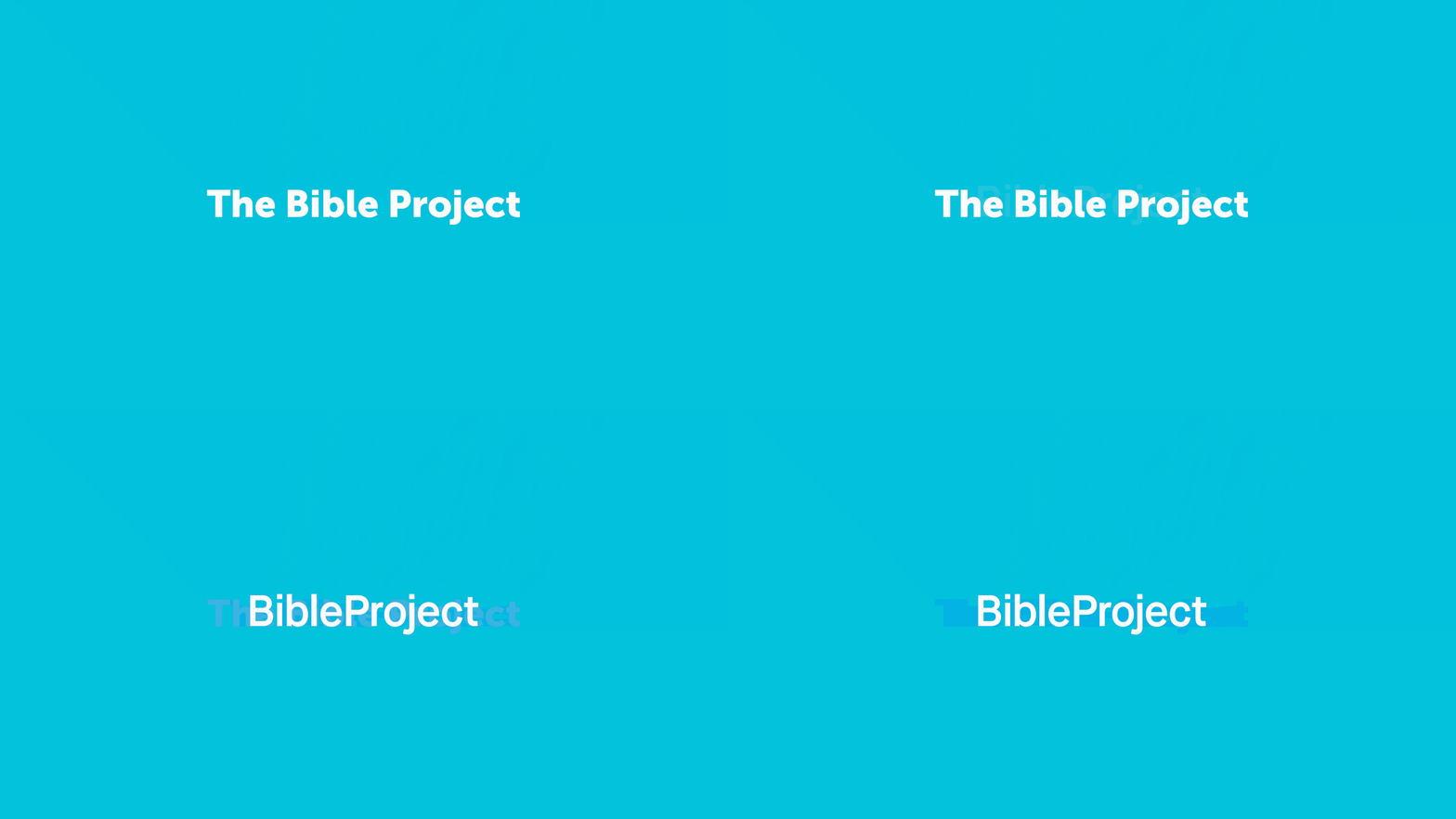
(Portland, OR—January 23, 2020) We’ve changed our look and shortened our name. The project has grown over the last five years, but our mark hasn’t grown with us. We were in need of a strong brand that better represented where we’re at now and where we’re hoping to go.

Same project, updated brand.
With this brand evolution, we wanted to do what was best for our audience. This project has grown from a small startup in a basement to a robust library of 140+ videos, 150+ podcast episodes, and videos in 13 different languages and more underway. But we think there’s a lot more to do. A brand is ultimately a way to establish and maintain a relationship with someone. We hope this new icon, new name, even the new blue, will serve millions more around the world. You can expect the same quality resources from BibleProject with just a slightly different look.

Our new mark is a better ambassador.
The most obvious change is that words are no longer in the logo. Taking the words out means our brand is easier to use in more contexts on paper and on screen but also around the world. Even when it’s small, it’s distinct. Also we love that the speech bubble is still there, but it also incorporates the image of a book. We always want to be known as the ones talking about this book.

Our new name fits better (and isn’t really new).
“The Bible Project” made sense at the time, but without knowing the scope the project would eventually take, we didn’t consider how it would come off in other cultures. We didn’t want an entirely new name, but we wanted something that felt more distinct. BibleProject still holds the same meaning and is still connected to the past five and a half years of work, but it sounds more like a name––a unique title for what we do. (Think The Face Book vs Facebook).

Yes, the blue is different.
It’s a subtle change, but we think it’s a good one. We softened the turquoise so it would be easier on the eyes, especially when on a screen. When colors are too bright, they are hard to read on white, and white letters are hard to read on the bright background. There’s no special meaning behind it––we just didn’t want to hurt anyone’s eyes.
About all those old logos in our videos…
While it’s not perfect, YouTube is one of the most powerful tools we use to share our library. Not counting our Overview videos, we have about 68 videos on YouTube. A lot of people discover our work because of the many people that have watched and commented on those videos. We want to keep the library more accessible even if it means some videos will have the old logo on them. Keep an eye out for the new logo in the next release, How to Read the Bible: Parables.
What you can do.
This whole project has been powered by people like you from the beginning, and you can help us with this new brand launch too. We have a brand kit available to download for free (desktop only). You can use it if you want to talk about BibleProject at your school or church.
Fun fact Branding at this scale is difficult to do in-house. The new BibleProject brand was designed by the same team who made the Read Scripture logo. We’re grateful for Mackey Saturday, a fan of the project, who created a mark that’s as simple, sharp, and approachable as this organization.

 BibleProject Team
– Jan 23, 2020
